In this tutorial, you will learn how to create a bubble chart in google sheets. But first, let’s learn the basics.
What is a bubble chart?
A bubble chart is a type of charting where we represent the data in the form of bubbles and these types of charts are used when we have to represent multidimensional data. An example of multidimensional data is as below:-
| Family Members | Steps walked/day | Weight (pounds) | Hours spent on iPhone/day |
| Me | 2000 | 95 | 4 |
| Dad | 8000 | 67 | 1 |
| Mom | 4000 | 61 | 3 |
| Sister | 3000 | 85 | 6 |
Why do we need a bubble chart?
As we see from the above, Family members can be represented on the X-axis, and Weight on the Y-axis. But we have 2 more dimensions of the data which also need to be visualized on the chart and to do that we need a bubble type of chart.
A bubble chart is used to visualize a data set with 2 to 4 dimensions. The first two dimensions are coordinates (as in X and Y), whereas the other 2 dimensions are color and size respectively.
A bubble chart is a variation of the scatter plot but with an additional dimension which is size.
If we create a bubble chart for the above table data set, it will look like this
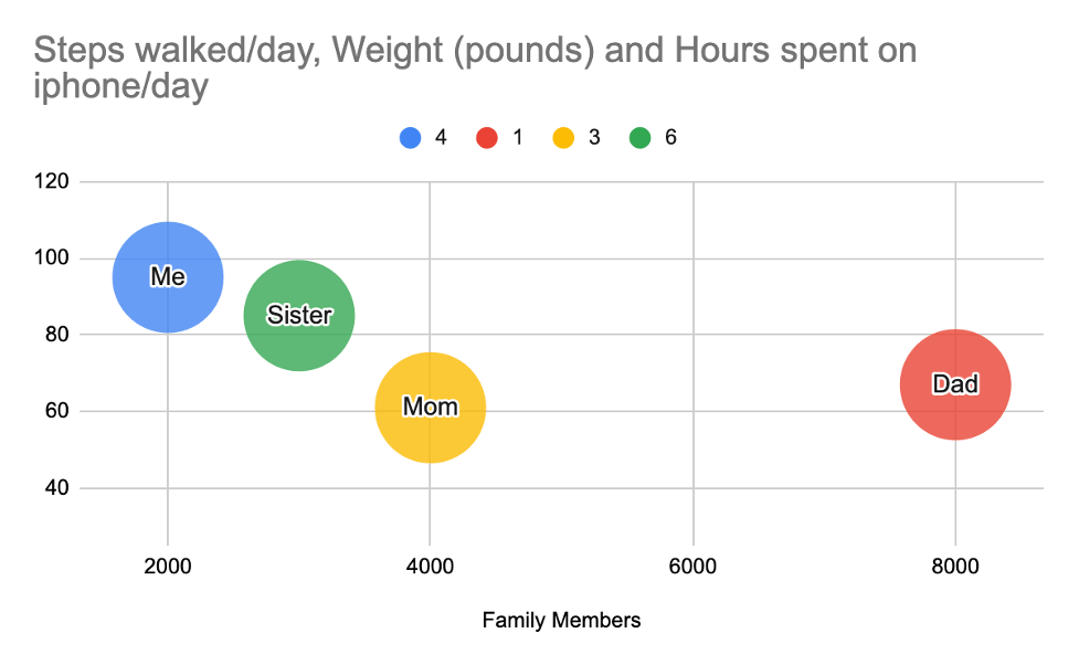
As you can see, it’s very clear from this chart to know 3 data points of a family member. I can see who walks more vs who’s on the phone less time vs what’s their weight.
If you try to plot the same data in a scatter chart, line chart, or bar chart, because of the dynamics of the data range, you will not be able to visualize the variation or trend of every data series on the chart.
Imagine we have thousands of such data and the data points vary by several orders of magnitude. A bubble chart will be very useful in such cases to visualize the data
How to create a bubble chart?
Now let’s look at how to create a bubble chart.
Before we create a bubble chart, we need to make sure that the data is in the desired format.
Here is the format requirement:-
| Column 0 | Column 1 | Column 2 | Column 3 | Column 5 | |
| Purpose | ID(Name of the bubble) | X coordinate | Y coordinate | Represents Color | Represents Size |
| Data Types | string | number | number | String or number | number |
Here, Column 0 should be the ID or Name of the bubble that we want to show on the bubble chart.
Columns 1 and 2 are your usual X and Y coordinates.
Column 3 represents color, meaning if we want our bubble to show up in a unique color for each type of ID (or Name as per Column 0), then we can adjust this column accordingly.
Column 4 represents the size of the bubble and this data has to be always numeric.
Let’s look at sample data about sales done by agents at a USA-based company.
| State | YTD Sales | Number of Sales | Sales Person | Last year Sales |
| Arizona | 600000 | 10 | Amy | 800000 |
| California | 500000 | 12 | John | 400000 |
| New York | 450000 | 6 | Steve | 300000 |
| Texas | 140000 | 12 | Olivia | 50000 |
| Florida | 540000 | 14 | Amelia | 100000 |
| Georgia | 300000 | 11 | Mark | 600000 |
| Ohio | 200000 | 8 | Tim | 550000 |
| Michigan | 50000 | 11 | Kiara | 80000 |
| Oregon | 150000 | 10 | Jack | 150000 |
| Nevada | 100000 | 13 | Catherine | 250000 |
Here the goal of the company is to find out states where sales are lagging and which salesperson from other states who have done good sales can be assigned to improve that state’s performance.
As we can see from the data, it has multiple dimensions, and to plot this on a chart, a bubble chart would be our default choice. Let’s plot a bubble chart.
Step-1:- First let’s make sure the data is in the desired format.
Our goal here is to find which state has lower sales in the current year as compared to last year.
So we need to plot last year’s sales data on X-axis, YTD sales data on Y-axis, and the third dimension or the bubble would represent the state name.
Also, we have a number of sales deal closed data which we can use as the size of the bubble (remember size column would always be numeric).
So we need to re-arrange the data in the below format.
| Sales Person | Last year Sales | YTD Sales | State | Number of Sales |
| Amy | 800000 | 600000 | Arizona | 10 |
| John | 400000 | 500000 | California | 12 |
| Steve | 300000 | 450000 | New York | 6 |
| Olivia | 50000 | 140000 | Texas | 12 |
| Amelia | 100000 | 540000 | Florida | 14 |
| Mark | 600000 | 300000 | Georgia | 11 |
| Tim | 550000 | 200000 | Ohio | 8 |
| Kiara | 80000 | 50000 | Michigan | 11 |
| Jack | 150000 | 150000 | Oregon | 10 |
| Catherine | 250000 | 100000 | Nevada | 13 |
Step-2: Open google sheets and create a new blank spreadsheet. Copy this data to the spreadsheet.
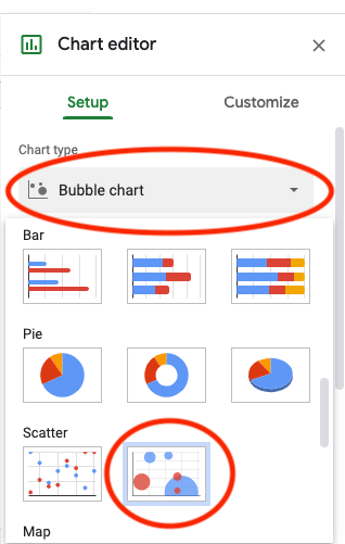
Step-3: Select all cells of the data and click on the insert tab from the top menu and select chart. By default, google sheets will plot a bar chart.
Step-4: Double click on the chart area to bring up the chart editor (sometimes the chart editor opens by default) and then under the setup tab section, click on chart type, and from the drop-down select bubble chart under Scatter. This will bring up the bubble chart now.
Step-5: The bubble chart here does not fit properly in the chart area because the data range on the X and Y axis are picked up by default. We need to change this to achieve a visually pleasing plot representation.
Click on the Y-axis and change the default minimum and maximum range.
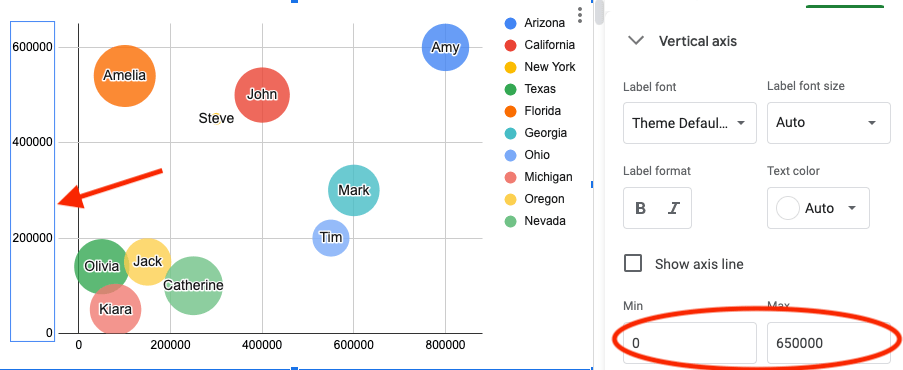
Now we can see that the bubbles fit the plot area properly. You can also change the labels of the plot area as you like.
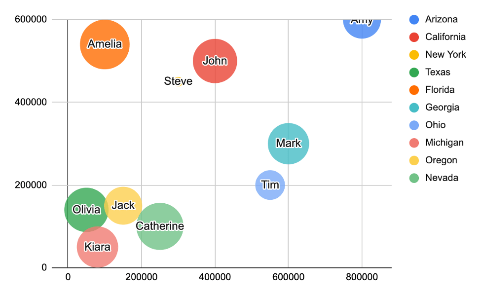
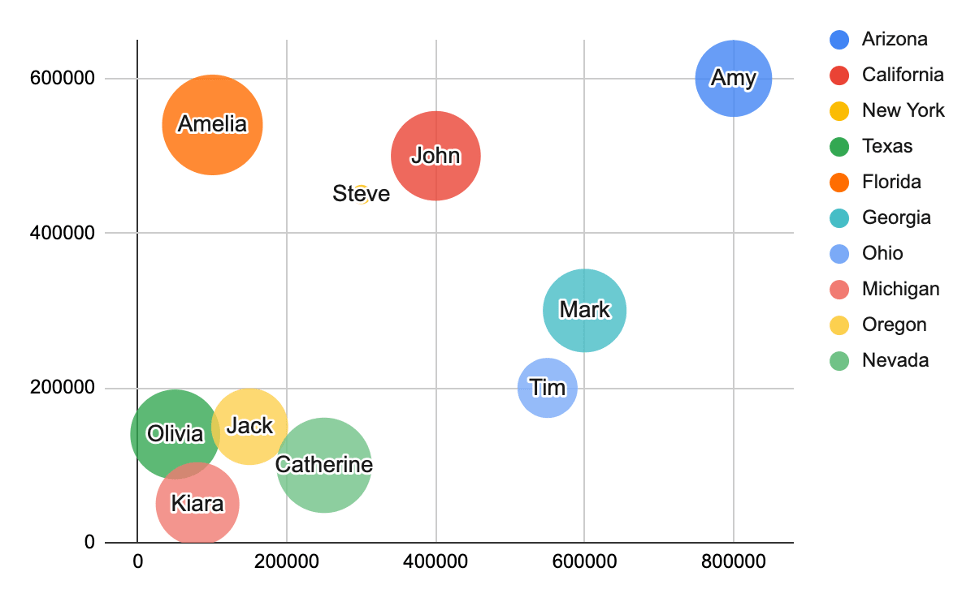
The final bubble chart will look like this.
Now let’s solve the goal of the company.
As we can see from this chart, sales in the state of Texas, Nevada, Michigan, and Oregon are lagging compared to other states. So we know which states need a replacement of a salesperson.
Now, let’s find out which salesperson has done an excellent job and we can bring them here.
From this bubble chart, it might look obvious that Amy who is currently in Arizona state has done an excellent job as the bubble is far right.
But if you look closely, you will see that Amy’s sales revenue is lower compared to last year. The two salespeople who have done a better job compared to last year are John and Steve.
Here is an interesting finding from the bubble chart size. If you look between Steve and John, the bubble size of Steve is quite smaller compared to John. The reason being Steve has closed less number of deals but still, the average sales revenue per deal is much higher compared to John.
John has done 12 sales totaling $500000 while Steve could achieve $450000 with only 6 sales.
So the logical choice will be to choose Steve to send to one of the lower sales states and John to the next one.
This is the beauty of bubble charts in google sheets. You can visualize and make logical decisions based on multi-dimensional data which is not possible with other types of charts.
How to customize a bubble chart?
The bubble chart in google sheets is pretty customizable. We can control various features of the chart by defining the data set as per our needs other than the visual customization that the google sheets charting feature provides.
How to change bubble size in a bubble chart in google sheets?
As per the data format requirement of bubble charts in google sheets, the fifth column controls the size of the bubbles. This column accepts numeric values only.
If we want a unique or small bubble size like the to scatter plots, we can put a unique number in the last column and copy it across the cells. This will make all bubbles look of the same size as a scatter plot in google sheets.
If we want unique color, we can set the same values all across the fourth column which represents the category differentiation of the data.
Change styling of the bubbles:-
We can also change the styling of the bubbles. While the chart editor is open (you can double click on the chart area to bring up the editor), under customize tab, expand the bubble section.
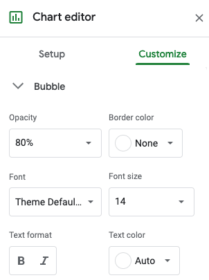
Here we can change the opacity of the bubbles which by default is set to 80%. Also, we can change the bubble border color, font color, and size of the text that appears on the bubble.
Advantages of bubble charts:-
- Bubble charts are a better charting option in google sheets when the data has more than 2 dimensions
- Bubbles are eye-catching and hence easy to visualize on the screen
Disadvantages of the bubble charts:-
- Sometimes if the X and Y coordinates of the bubbles are the same or similar, the bubbles look like overlapping with others
- If few values in the data set which decide the shape of the bubble are very small compared to the other values in the series, then the bubble might look so tiny that it’s hard to visualize it on the screen
- A bubble chart can not show trends over time but again that’s not why bubble charts are used for
Create bubble charts via app script:-
We can also create bubble charts using javascript. The reason for creating it through code is that we get a lot of customization options.
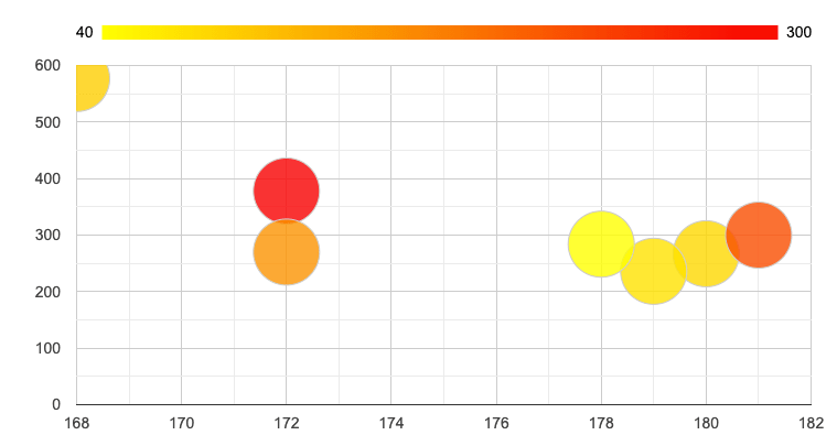
For example, if we want to show the bubbles in a single color gradient like the below bubble chart, we can achieve that via custom javascript code.
Here is how we will do it via javascript.
<html>
  <head>
    <script type="text/javascript" src="https://www.gstatic.com/charts/loader.js"></script>
    <script type="text/javascript">
      google.charts.load("current", {packages:["corechart"]});
      google.charts.setOnLoadCallback(drawChart);
      function drawChart() {
        var sampleData = google.visualization.arrayToDataTable([
          ['ID', 'X', 'Y', 'Temperature'],
          ['',   180,  267,      80],
          ['',   179,  236,      70],
          ['',   178,  284,      40],
          ['',   172,  378,      300],
          ['',   181,  300,      220],
          ['',   172,  270,      150],
          ['',   168,  577,      90]
        ]);

        var options = {
          colorAxis: {colors: ['yellow', 'red']},
           animation.duration :
        };

        var bubbleChart = new google.visualization.BubbleChart(document.getElementById('plotDiv'));
        bubbleChart.draw(sampleData, options);
      }
    </script>
  </head>
  <body>
    <div id="plotDiv" style="width: 1000px; height: 500px;"></div>
  </body>
</html>
First, let’s include the chart loader js file in the header section inside the script tag. Then let’s load the current package using the “google.charts.load” method. Now create a page load call back using “google.charts.setOnLoadCallback” method and pass the function which will be used to draw the chart.
The sample data used here for plotting the bubble chart looks like this
| X | Y | Temperature |
| 180 | 267 | 80 |
| 179 | 236 | 70 |
| 178 | 284 | 40 |
| 172 | 378 | 300 |
| 181 | 300 | 220 |
| 172 | 270 | 150 |
| 168 | 577 | 90 |
Note that in the code, we have added one more column called “ID” at the start as it is a required data format for creating bubble charts. Also, the Temperature column here represents the color temperature when moving from yellow to red.
Take out from creating bubble chart in google sheets
- Decide what type of data set you want to present as a bubble chart
- Arrange the data first in the desired format. This will help to plot the bubble chart easily
- Choose the shape column and color column wisely
- Format the axis properly so that the bubbles are visible inside the plot area
- Make sure the ID column which represents the text on top of the bubble is not too big and adjust its font size and font color to have a pleasant look
Learn about other types of charts like box and whisker plots in google sheets and line charts with multiple lines in google sheets or explore all chart types possible in google sheets here
New to google sheets ? Start here
More about Data analysis in google sheets:
