Line charts are the easiest way to visualize your data in google sheets. It helps us to understand the data points in a better way.
While it is easier to plot and edit line charts with 2 data columns, it becomes complex when we have more than 2 columns. In this tutorial we will see how to make line charts with multiple lines and how to edit them as per our need.
Table of Content:-
- Why do we need a line chart with multiple lines ?
- How to create a line chart with multiple lines ?
- Examples of multiple line charts with advanced data set
- When not to use line charts
Why do we need a line chart with multiple lines?
We need multiple lines chart to correlate the data points and discover if there are any patterns out there.
Suppose we have multiple data series which are collected at the same time or we want to compare data collected at different time periods, in such cases instead of making separate single line charts, we can use a single chart and plot multiple lines of the data series to make them much more presentable.
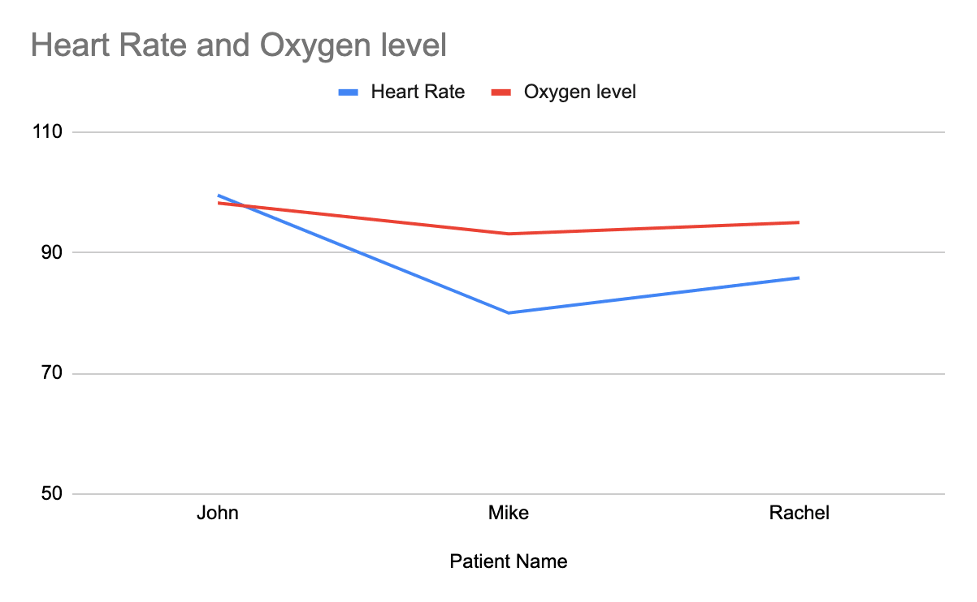
Example of multiple data collected at same time:-
| Patient Name | Heart Rate | Oxygen level |
| John | 99.5 | 98.2 |
| Mike | 80 | 93.1 |
| Rachel | 85.8 | 95 |
Here we have examined different people for their heart rate and blood oxygen level. We want to see what happens to blood oxygen level when heart rate falls.
In the above examples, we can plot a line graph with multiple lines to visualize. Here is how it will look:-
How to create a line chart with multiple lines ?
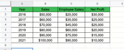
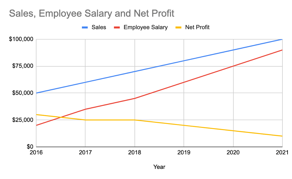
Let’s say we want have the below set of data about a company financials
| Year | Sales | Employee Salary | Net Profit |
| 2016 | $50,000 | $20,000 | $30,000 |
| 2017 | $60,000 | $35,000 | $25,000 |
| 2018 | $70,000 | $45,000 | $25,000 |
| 2019 | $80,000 | $60,000 | $20,000 |
| 2020 | $90,000 | $75,000 | $15,000 |
| 2021 | $100,000 | $90,000 | $10,000 |
Here we have year wise sales, salaries and net profit data. We want to visualize this in a presentable manner.
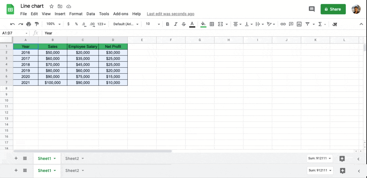
Step-1: Select all your data and labels that you want to visualize in chart
Tip:- If the data you are selecting is the only data inside the spreadsheet, you can just select one row and hit Ctl+A in windows or Cmd+A in a mac.
Step-2: With the data points selected, from the top menu, click on insert and select chart. This will bring up the chart with default type.
Tip:- You can also click on the chart icon ![]()
![]() from top ribbon menu to bring up the chart
from top ribbon menu to bring up the chart
Step-3: By default google sheets will show a bar chart. To convert the bar chart to line chart, you need to change the chart type to line chart inside the chart editor shown at the right hand side.
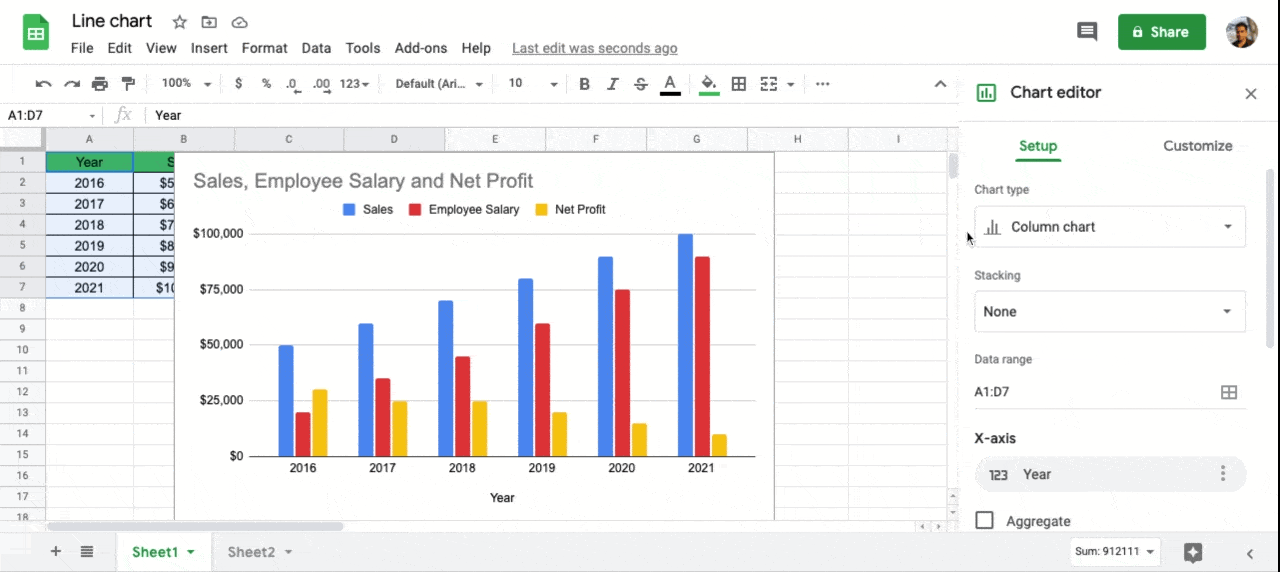
Tip:- Most of the time a chart editor will appear automatically when you first insert a chart. But you can bring it up manually by double clicking on the chart area or clicking on the 3 dot menu of the chart and selecting edit.
The final chart will look like this:-
Examples of multiple line charts with advanced data set
Example-1: Multiple line chart with secondary Axis
Let’s take an example of below set of data:-
| iphone models | iphone6 | iphone7 | iphone8 | iphonex |
| price | $399 | $450 | $499 | $699 |
| sales/month | 9000000 | 7000000 | 1000000 | 4000000 |
Here is a data set about iphone models with their price and sales numbers from an online marketplace. We want to plot this data as a line graph to understand what’s the correlation between iphone models, their price and sales volume.
We can select all the data points with labels and click on the insert chart from insert menu. This will bring up the below chart.
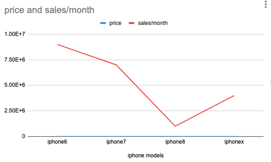
As you can see from the chart, the price variation of different iphone models is almost invisible on the chart. This happened because of the higher range in Y-axis, which google sheets gave us by default. The reason behind this high range is that google sheet looked at the minimum and maximum from sales volume and product price column and calculated the range.
This is a typical problem with line charts or multiple line charts. Line charts do not work well when you have a wide range of data.
Here in this example, the range of iphone product prices vary from 399 to 699. But the range of sales numbers are between 1 million to 10 million.
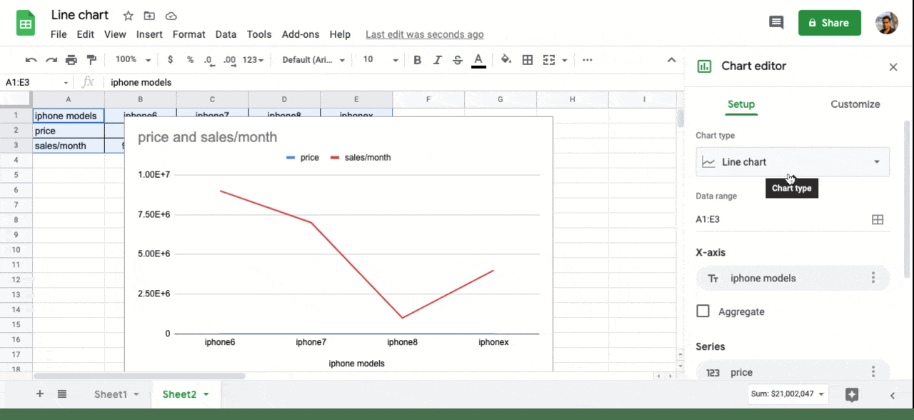
To solve this problem, we can plot a multi line chart with a secondary axis.
To do this, go to the chart edit window, and select the customize tab. Now expand the series option and select the series that you want to visualize on the second axis. Here we will select “Price” series and then scroll down a bit to Axis selection. Here we will choose from drop down, right Axis. Now you will be able to see the line graph for price clearly.
The final chart will look like this:-
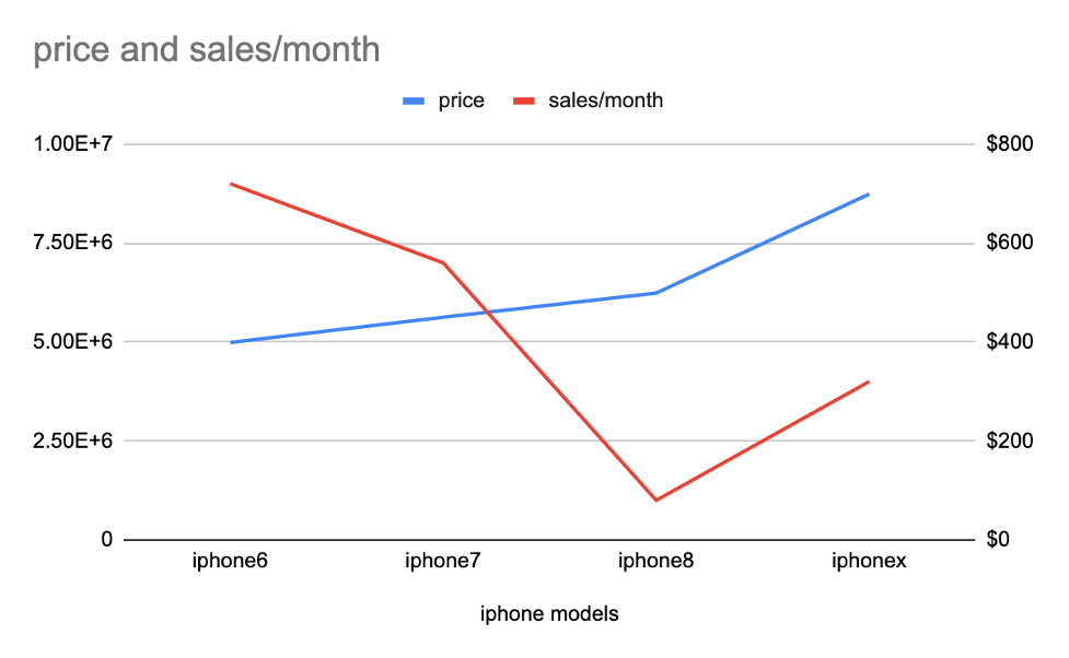
Here we can clearly see the correlation between all 3 data sets. We can see that excluding iphoneX, for all other iphones sell high where the procut price is low. The secondary axis makes the data much more readable and presentable.
Example-2: Multiple line chart in combination with column chart
In the previous example we plotted a line chart with 3 parameters or labels. Now let us add one more data label to the same table.
| iphone models | iphone6 | iphone7 | iphone8 | iphonex |
| price | $399 | $450 | $499 | $699 |
| sales/month | 9000000 | 7000000 | 1000000 | 4000000 |
| camera pixel | 8 | 10 | 10 | 12 |
Here we have added the camera pixel as one more data point. Lets plot a multi line chart similar to example-1.
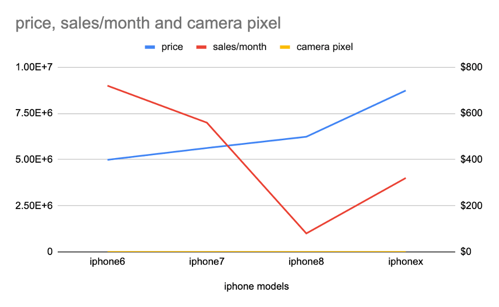
As you can see the yellow line at the bottom is almost invisible. This is because we have added yet another set of data with very wide range as compared to the other data series. Here the range is only between 8 to 12 which is very low compared to Price or Sales/month data.
This is a clear limitation of line chart or multi line chart. To solve this, we need to plot a bubble chart. Here is how to do it:-
In the chart editor, under the setup tab, click on the chart type selection box and select bubble chart under Scatter plot type. When you do that, you will see this:-
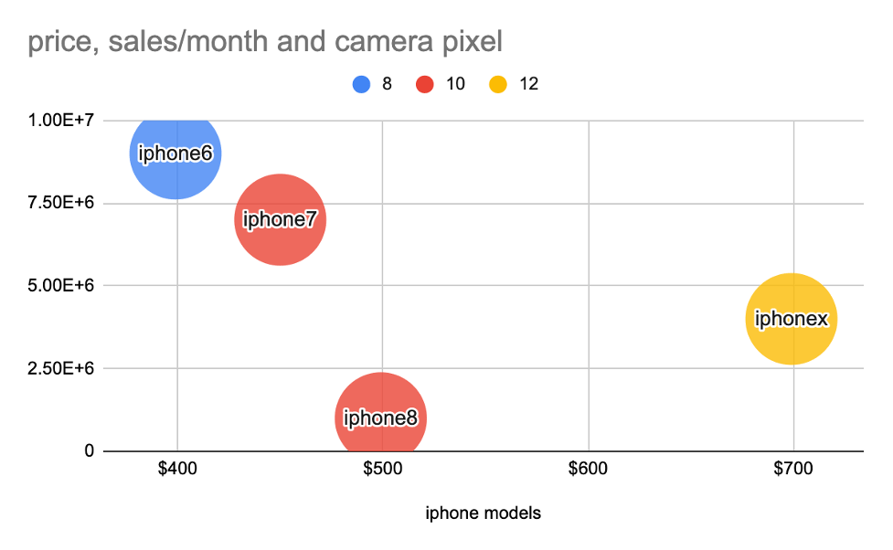
As you can see here, bubble chart is a much better visualization compared to the multi line chart that we plotted earlier with the same set of data.
Here we can clearly see that iphone 6 with 8 megapixel beats iphone8 with 10 megapixel in sales numbers.
When not to use line charts
- Line graphs should only be used to show data over time
- If there is a wide range of data, then it is difficult to read them via multiple line charts
- If the scale on the axis is not consistent, then the line graph representation may not look accurate
- Line charts does not work well when the data is in decimal or in fraction format
- If there are more number of series of data, then multiple line charts might look cluttered which is hard to interpret
Learn about other types of charts like box and whisker plot in google sheets and bubble charts in google sheets or explore all chart types possible in google sheets here
