Box and whisker plot are used to summarize the distribution of a large data set using 5 statistical numbers i.e minimum, first quartile, median, third quartile and maximum.
Many times the central tendency (mean, median, mode) does not tell us enough about the data and we need more information like its variability. In such cases, a box and whisker plot quickly shows us if our data is spread symmetrically or it has any skewness. Also it highlights outliers if any. Visualizing this makes it easier to make decisions about the data.
What is required to create?
To create a box and whisker type of plot in google sheets, we need 5 important data points.
- Min (The smallest value)
- First quartile (Q1) – It is the middle number between Minimum and Median
- Median (Its a middle number when the data set is organized in ascending order)
- Third quartile – It is the middle number between Median and Maximum
- Max (The largest value of the data set)
Please note that google sheets does not have the option to plot box and whisker chart under chart type. But it has the candlestick chart type which we can use to mimic the box and whisker chart.
How to create a box and whisker plot in google sheets ?
Step-1: Format the data. Organize it in one column
Let’s say we have the record of temperatures(in F) of Los Angeles city for 10 days as given below
34, 76, 29, 15, 41, 46, 25, 54, 38, 20, 32, 43, 22
We need to put these in one column or row in sheets. It will be helpful when selecting the data series and calculating statistical five numbers in next step.
Step-2: Calculate the statistical five number summary
Now that the data is arranged in a column, we can need to calculate the min, max, first quartile, third quartile and the median.
Min :- To calculate the smallest value, we can use the in-built min() function
First quartile (Q1) :- To calculate the first quartile we can use the in-built Quartile() function. This function takes two parameters. One for the data series where we want to calculate and second is the numeric input of the quartile number. For this example it will be Quartile(data series, 1)
Median:- To calculate median, we can use the in-built median() function which will tell us the middle number of the series when sorted ascendically or descendically
Third quartile (Q3) :- Similar to the first quartile calculation, here we can use the Quartile() function and pass “3” as the numeric value. It will be Quartile(data series, 3)
Max:- It is the maximum value in the series. We can use the in-built max() function over the data series to get the largest number

Note:- We have added a cell named “Temperature” at the start of the row. A cell with type as text is required to plot the candlestick chart in google sheet.
Step-3: Eliminate outliers (optional)
An outlier is a value which is extremely small or extremely large as compared to the data series and these outliers influence the overall spread and skewness of the data and also change the mean.
We should ideally avoid these outliers in order to make a logically correct decision.
How to calculate an outlier while plotting box and whisker plot ?
First we need to calculate IQR which is called inter quartile range. This is the difference between Quartile 3 and Quartile 2.
IQR = Q3 – Q2 = 33 – 22.75 = 10.25
The range within which our data should lie is defined by this formula
[Q1 – 1.5 IQR, Q3 + 1.5IQR]
If we plug our values in this range would be [22.75 – 1.5*10.25, 42.5 + 1.5*10.25]
This comes to [7.375, 57.875]
We can round these, so the data range should be between 7 and 58
When we sort our data in ascending order, we can see that the lowest value is 15 which is within this range, whereas the largest value 76 is out of the range.
We can optionally eliminate 76 and plot the box and whisker chart.
Step-4: Select 5 number summary and insert a candlestick plot
Now it’s time to plot the chart. First we will plot the data without eliminating the outlier.
We can select the 5 summary numbers and the text field and click on the inset menu and select chart. Many times, google sheet will automatically insert the candlestick chart for this kind of data selection, if not then we can open the chart editor by double clicking on the chart area and then from chart type dropdown, we can select chart type as candlestick from the other section.
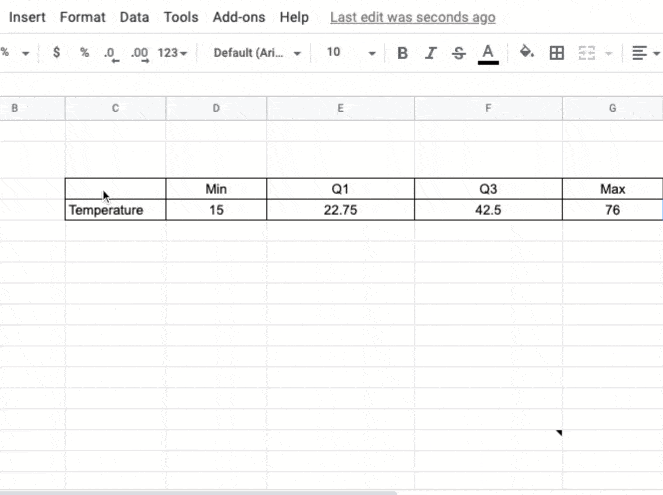
Here is how it will look finally.
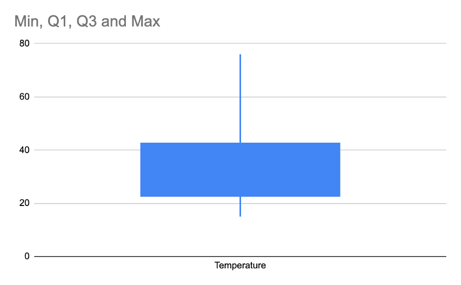
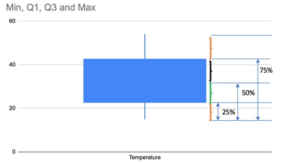
Lets understand various terminology used in the above box and whisker plot.
Understanding a box plot
The box and whisker plot might look a little difficult to read from the first sight, but once you understand various sections of the plot area, it will be a piece of cake.
In this plot, the rectangular area represents a box and the thin lines on each side represents whiskers.
Min : The starting point of the whisker represents the smallest value in our data set
Q1: The starting point of the box or the ending point of the whisker from the smallest data side, represents the first quartile
First quartile is also known as the 25th percentile. And it’s represented by the middle number between the smallest number (not ‘minimum’) and median of the data set.
Median: In the google sheet candlestick chart it does not visually show us the median of the box area, but we should note that the vertical middle point (for vertical box and whisker chart) of the box represents the median.
Median here also can be called as 50th percentile or Second quartile
Q3: The starting point of the second whisker which ends with the largest data point is called third quartile. It’s also the end point of the box.
Third quartile is also known as the 75th percentile. And it’s represented by the middle number between the median and the largest number (not ‘maximum’) of the data set.
Max: The max is represented by the largest data point in our data set. It’s the end point of the second whisker.
IQR: The inter quartile range is the difference between Third and first quartile i.e 25th to 75th percentile
Outlier in a box and whisker plot, how to plot them
As highlighted in step-4, in this data set, we found 76 to be an outlier. We saw how to calculate an outlier.
An outlier always represents additional skewness in the data. For example here in the temperature reading we can say that the highest temperature is 76 fahrenheit whereas the second highest temperature is 54.
This difference between the two highest temperatures is very much compared to the general difference between any other consecutive data when sorted in ascending order.
We should eliminate this data point to accurately represent the temperature distribution in Los Angeles for the past 10 days.
So our final data of 5 number summary would look like this
| Min | Q1 | Q3 | Max | |
| Temperature | 15 | 22.75 | 42.5 | 54 |
Note that the Max is now 54. Now our box and whisker plot will look like this
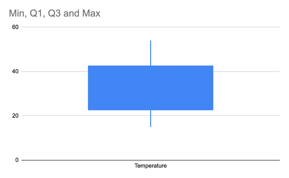
When we compare this plot with the one with outlier, this plot tells us that our data is mostly spread out symmetrically as compared to the first plot where it was looking like it was skewed towards right.
Real life example for data analysis
Let’s look at a real life problem and plot it in google sheets.
We have collected sample data from a Apparel company who sold women apparel in the past 1 week, using their 3 exclusive stores in 3 different cities in the USA. Here is the data.
Revenue from San Francisco is as below from different buyers:-
200, 400, 600, 900, 1200, 400, 1100, 400, 2000
Revenue from Chicago is as below from different buyers:-
700, 400, 500, 300, 600, 200, 800, 900
Revenue from Newyork city is as below from different buyers:-
1500, 800, 300, 200, 1200, 3000, 700, 500, 1500
P.S:- Do note that this is just a sample collection. In actual scenario, you might have thousands of such data for each city.
Problem statement:- The store owner has a sample list of buyers who have all spent more than $520 on a transaction. Store owner wants to know which city it would likely be ?
Before we plot the chart, let’s highlight in the below figure, what a box and whisker chart represents in terms of percentile.
Above data is of the First example of Los Angeles temperature distribution that we discussed at the start.
Now Lets plot the box and whisker chart for the Apparel company.
First, lets get the 5 number summary for each store.
It will look like this:-
| Min | Q1 | Median | Q3 | Max | |
| Chicago | 200 | 375 | 550 | 725 | 900 |
| San Francisco | 200 | 400 | 600 | 1100 | 2000 |
| New York | 200 | 500 | 800 | 1500 | 3000 |
If we plot the candlestick chart in google sheet to mimic the box and whisker plot, it will look like this
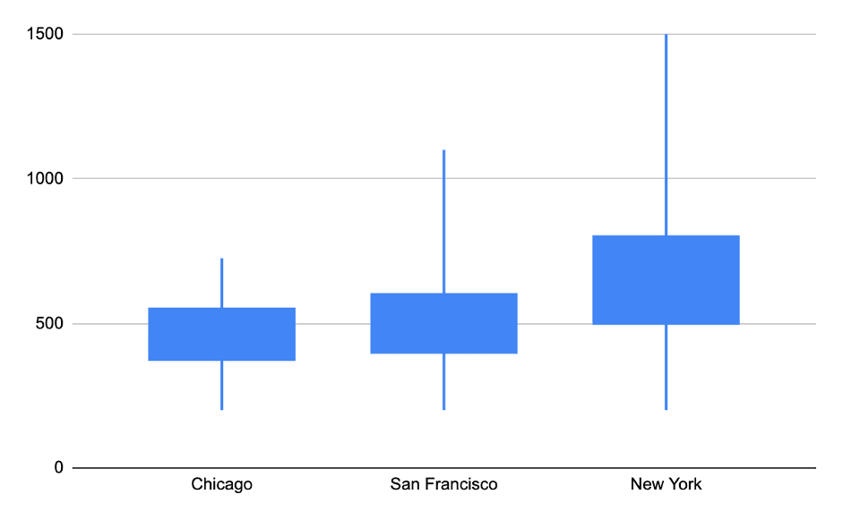
The chart here compares all the store revenue in a single plot area.
From this plot, we can see that the Q1 of New York city is $500, which means 75% of the sales in NYC is greater than $500.
This compared to San Francisco, only 50% has more than $500 revenue buyers. Chicago has more than 60% below $500.
So it’s clear that if we sample users who did a transaction greater than $525, then they will be most likely from New York.
Note that, here we have not yet considered outliers, but in a large data set of thousands or millions of records, outliers can influence this decision. So it’s always advisable to separate the outliers when making a decision.
Learn about other type of charts like bubble chart or line charts in google sheets.
