Charts are an essential part of any spreadsheet application. If you have been using Google Sheets, then you must have come across pivot tables. They help you summarize data by adding a third dimension.
Though Pivot tables offer powerful analysis capabilities when dealing with massive amounts of data, a graphical interface makes the summary more readable.
Enter Pivot charts.
How to create a Pivot chart in google sheets?
You will first create a Pivot table and then insert a chart.
Here are the steps to create a pivot chart in google sheets:
- Highlight the data and from the menu select Insert > Pivot table
- Select “New Sheet” and click on Create
- Now fill the rows, columns, and values you want to display in your table
- Highlight the pivot table and from the menu select Insert > Chart
- The output will display a pivot chart on your screen
This is how you create pivot chart in google sheets.
Here is a video explaining the concept of Pivot chart in google sheets with an example:
Table of content
What is a pivot chart?
A pivot chart is a chart that represents data from the underlying pivot table. As with any chart, pivot charts update dynamically with changes in data from the pivot table.
Google sheets pivot charts are powerful and easy to use. Though pivot tables can summarize the data, the graphical interface of Pivot charts gives you more insights visually.
In this tutorial, we will learn step by step to create a pivot chart in google sheets. We will create Pie charts, Bar charts, and many other interesting chart types. We will also see practical use cases and much more. Let’s jump in.
How to create pivot charts in google sheets – details
Pivot charts are simple to create. First, you need to create the pivot table and then draw a chart on it.
Below are the detailed steps to create them.
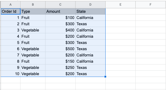
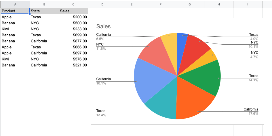
We have a list of sales items with their type and sales in each category. We want to know which category type has contributed the highest to total sales.
Step-1:
First, select the data for the pivot table. In the below table we have selected A1 to D11 cells.
Step-2:
While the range is selected, click on Insert from the menu and choose “Pivot table”.

Step-3:
Now choose where you want to create this table. You can choose New sheet and click on create.

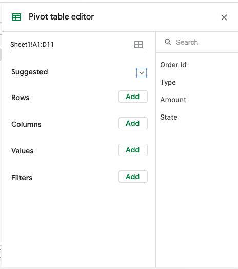
This will bring up the Pivot table editor. Here you can define the rows, columns, values, and filters for the table.
Step-4:
I want to know the total order value of each type of item. So I will click on Add next to Rows and choose “Type” from the drop-down under the “Sort by” field. This will define the rows in column A. Note that I have removed the selection from the “Show totals” checkbox.
To add value next to each item, you can select Add button next to the “Values” field and make sure in the “Summarized by” field, SUM is selected.

As soon as you do this, the pivot table will be created as you can see below.
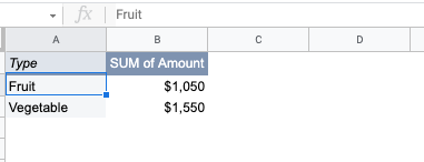
Here it shows the Type of items in column A and the sum of their sales value in column B.
Step-5:
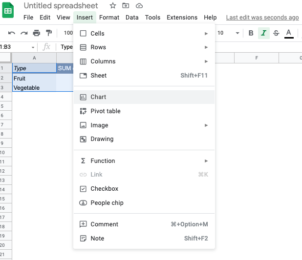
Now that the pivot table has been created, you can create the pivot chart.
Select the entire table range and click on Insert from the menu and then select the Chart option.
This will bring up the pivot chart on your screen. As you can see here, the pie chart shows both the category and their percentage contribution to the total sales.
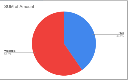
This is how you create the pivot chart in google sheets.
Pie chart
Pie charts are best used when you have data from different categories and you want to figure out the contribution of each category as part of the whole. The audience sees this chart and quickly understands the comparison between different categories.
The pivot chart we plotted in our previous example is a pie chart.
If the pie chart option is not selected by default, then you can select it from the “Chart type” under the “Set up tab” of the “Chart editor” window.
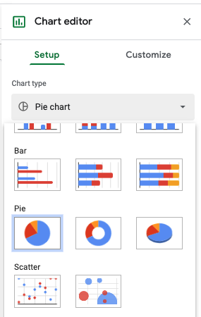
There are 3 options for the pie chart. You can choose from the default pie chart, doughnut chart, or 3d chart. You can also customize the pie chart by selecting the customize tab and choosing the option for “Pie chart”.
Bar chart
To plot the bar chart as the pivot chart type, you can select the bar chart from the “Chart type” drop-down options in the chart editor window.
Here is what the output will look like when we change the pivot chart type to a bar chart.
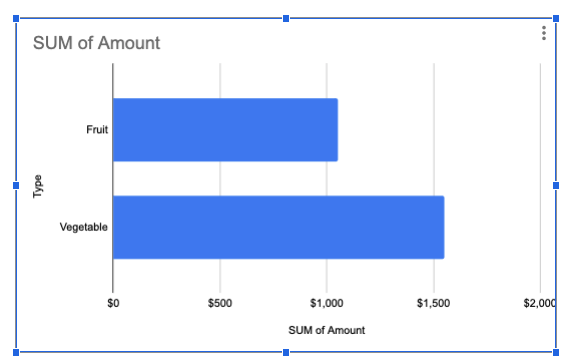
While pie charts are a great visualization method, it has certain shortcomings. Like when you have more categories and contributions from a few categories do not have a large difference, it’s difficult to understand this from a pie chart.
In such cases, the bar chart gives a clearer picture and hence we prefer to use the bar chart over a pie chart.

Sparkline chart
The difference between a typical chart and a sparkline chart is that a typical chart covers all data points in the range while a sparkline chart only focuses on a specific row or column.
Sparkline charts live inside a cell and are used to show trends in a series of values.
Let’s say we have a data set like this.
| Fruit Sales | Q1 | Q2 | Q3 | Q4 |
| Apple | 95 | 125 | 300 | 400 |
| Orange | 300 | 185 | 150 | 100 |
| Mango | 20 | 200 | 150 | 10 |
| Kiwi | 225 | 145 | 180 | 100 |
We want to see the trend of sales for each fruit overall quarters.
To do this, at the end of each row, we can add a formula like this to plot a sparkline graph.
=SPARKLINE(B2:E2)
Here is what it will look like:

As you can see, the F column will plot the trend graph for each data series in the row.
Pivot chart slicer in google sheets
Slicers are on-screen buttons used for quick filtering data in tables, pivot tables, charts, or pivot charts.
Slicers are a great addition to visualizing data in google sheets. Here is how you can add a slicer to pivot charts in google sheets.
Let’s say we have the pivot table and pivot chart.
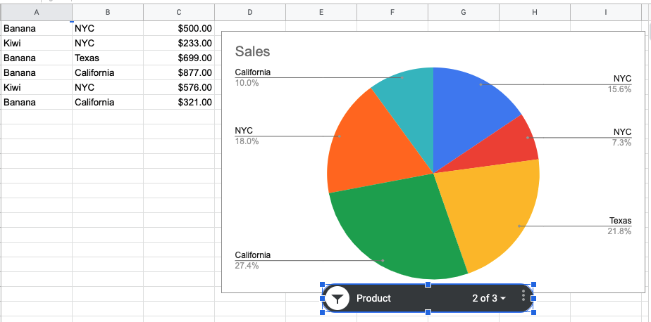
| Banana | NYC | $500.00 |
| Kiwi | NYC | $233.00 |
| Banana | Texas | $699.00 |
| Banana | California | $877.00 |
| Kiwi | NYC | $576.00 |
| Banana | California | $321.00 |
Copy Data
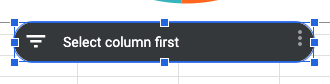
Now to add a slicer, go to the Data tab in the menu and select “Add slicer”. This will add a slicer.
From the slicer edit window, choose a column that you want to use as a filter. I have selected the Products column.
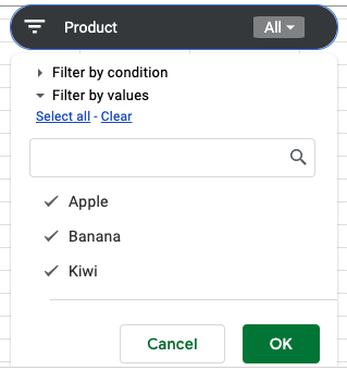
I unchecked “Apple” from the products list and pressed the OK button.
Now the slicer will remove Apple from the product sales list and only consider Bananas and kiwi. Accordingly, the chart will be updated instantly. This is the beauty of slicer tools.
FAQ
How to create pivot chart in google sheets?
To create pivot chart, first create a picot table. Then select the entire table and insert a chart from the Menu (Insert > Chart).
What is the difference between pivot chart and others?
Pivot charts are created for pivot tables.
Wrapping up
In this tutorial, you learned how to create pivot charts in google sheets. You saw how to use bar charts, pie charts, and sparkline charts.
Google sheets pivot charts are a smart way to visualize your data. Go ahead and use the techniques you learned here in your next project.
Appendix
[1] Customise pivot tables in google sheets – Link
Further Reading
New to google sheets ? Start here
More about Data analysis in google sheets:
