We use scatter plots when we want to check the relationship between two variables. When we plot two variables on a scatter chart, we can see their relationship and more importantly if there is any trend.
While plotting with 2 variables is easy, when the number increases, it gets a little complex. In this tutorial, we will learn how to create a scatter plot with multiple series in google sheets.
In this tutorial, we will discuss about google sheets scatter plot multiple series use cases. You will see 2 different scatter plot examples with multiple series.
Here are 2 types multiple series scatter plots in google sheets:
- Scatter plot with one X series and 2 Y series
- Scatter plot with 2 X series and 2 Y series
Table of content:
How to create a scatter plot in google sheets
Let’s say you have 2 variables in columns A and B. You want to create a scatter plot.
You can select all cells in columns A and B and click on Insert > Chart. From the chart options, select scatter plot. This will plot a scatter plot on your screen. This is fairly straightforward.
| Month | Stock 1 return |
| Jan | 10% |
| Feb | 12% |
| Mar | 13% |
| April | 12% |
| May | 18% |
| June | 20% |
Here is a video showing google sheets scatter plot multiple series example.
Let’s see how the chart works when we have another variable list in column C.
Google sheets scatter plot multiple series examples – One X, two Y series
As you see from the below data, we now have an additional column named “Benchmark return”.
Now we want to compare our stock’s return vs the market benchmark.
| Month | Stock 1 return | Benchmark return |
| Jan | 10% | 12% |
| Feb | 12% | 14% |
| Mar | 13% | 16% |
| April | 12% | 16% |
| May | 18% | 20% |
| June | 20% | 22% |
We have 1 X-series and 2 Y-series of data. Let’s plot them.
To plot, select all the data from A1 to C7 and click on Insert > Chart. This should bring up the scatter chart by default as google sheets will automatically know the best chart type based on the data type.
If it does not bring the scatter plot then you can manually change the plot type to Scatter plot from the Chart options.
Here is how it will look:
As you can see, the stock return vs Benchmark return trend is visible. Looking at this plot, you can say that our stock has underperformed compared to the market benchmark.
You can add more Y-series and plot them in one chart. You can use the Chart options > Customize options to customize the labels and colors for each data series.
This is how you plot the scatter chart with 2 y-series data.
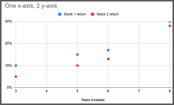
Google sheets scatter plot multiple series examples – Two X, two Y series
Now let’s see how to plot when we have 2 X-series data with 2 Y-series data.
Here is an example data:
| Month (X1) | Stock 1 return (Y2) | Month (X2) | Stock 2 return (Y2) |
| Jan | 10% | May | 5% |
| Feb | 12% | June | 7% |
| Mar | 13% | July | 8% |
| April | 12% | Aug | 9% |
| May | 18% | Sep | 11% |
| June | 20% | Oct | 15% |
Here we have 2 X-series data we need to show on X-axis.
In google sheets, you can not plot 2 independent variables on X-axis.
So what do we do? We will combine the X-series data into 1 and then we will plot the Y1 and Y2 series data.
Note that this will only work if the data type in X1 and X2 are related. And in most of the problems they are related, or else why would you plot them in the same chart.
So We will rearrange the data in the table like this
| Month | Stock 1 return | Stock 2 return |
| Jan | 10% | |
| Feb | 12% | |
| Mar | 13% | |
| April | 12% | |
| May | 18% | |
| June | 20% | |
| May | 5% | |
| June | 7% | |
| July | 8% | |
| Aug | 9% | |
| Sep | 11% | |
| Oct | 15% |
Notice what I have done here. I have kept one label for the X series which is “Month” and added X2 data below X1.
Then to maintain the same relation between X2 vs Y2, I have placed data in Y2 in the same row as X2.
Now you can plot the scatter chart.
Select all the data from A1 to C13 and insert a scatter plot.
This will look like this:
As you can see here with a scatter plot we can see the stock return trends for both the stocks.
This is how you will create a scatter plot with multiple series in google sheets.
FAQ – Google sheets scatter plot multiple series
How to make a scatter plot with two sets of data in google sheets?
To make a scatter plot with two sets of data, you can select all of them and click on Insert > Chart and then select Scatter plot from chart options. It’s the same as creating normal scatter plots as long as the data types are related.
How to add different colors to multiple data series in scatter plots?
To add unique colors to the data series, you can double-click on the chart area to open the chart options. Inside chart options, you can change the color settings under the Customize tab.
Wrapping up
In this tutorial, we learned about google sheets scatter plot multiple series type of problems. Scatter plots are very much helpful in data visualization. It helps in figuring out the trend of data.
With Google sheets scatter plot multiple series guide, you can now understand the relation between them visually. Go ahead and try this on your own worksheet.
Appendix
Google sheets scatter plot multiple series additional resources.
[1] Scatter charts in google sheets – Link
Further Reading
New to google sheets ? Start here
More about Data analysis in google sheets:
