SheetsIQ Tools for Google Sheets
Add-on for google sheets to 10x your productivity. Advance find duplicates, merge sheets, split data, text processing and many more.
No trial, no credit card required.
30+ smart tools to supercharge your sheets
No need to write formulas. Complex data calculation with few clicks. Save hours.

No-code No-formula data manipulation
SheetsIQ Tools is an add-on for Google Sheets™ to help you become super productive. With 30+ smart tools you can supercharge your data manipulation and calculation without writing any formula or app script code
Top features of SheetsIQ Tools
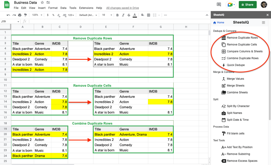
Dedupe
– Remove duplicate rows
– Remove duplicate cells
– Compare column & sheets
– Combine duplicate rows
– Quick dedupe

Merge & Combine
– Merge values
– Merge sheets
– Combine sheets
Text Processing
– Add text by position
– Remove substring
– Remove excess spaces
– Remove character by position
– Replace symbol
– Polish text

Split Data
– Split by character
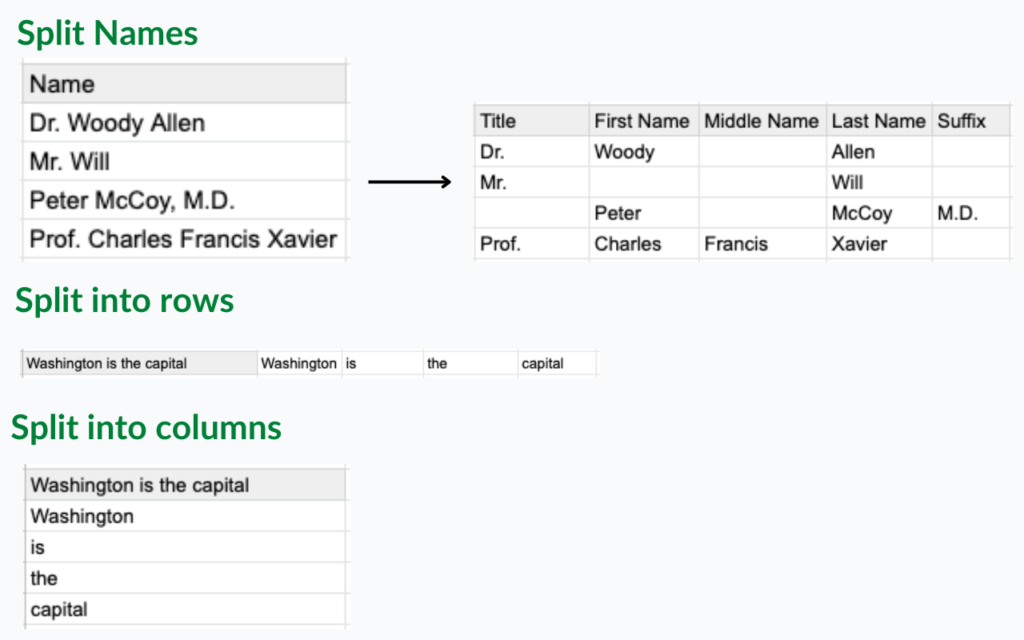
– Split names
– Split rows & columns
– Split dates
General Tools
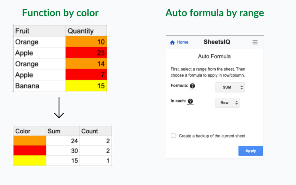
– Auto formula
– Function by color
– Change case
– Freeze & unfreeze
– Remove blanks
– Unpivot table
– Flip cells
– Unmerge cells